The Colour Version of the Subtitles
A composer who writes 'Orange \ Sacrum' on a stave, a violinist wearing three thousand LEDs at the Met, and the 1911 score that asked for light and never said how to play it.
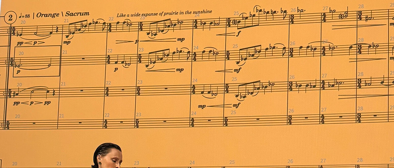
Stephanie Ann Boyd has never heard music without seeing it. On 20 September, at the Metropolitan Museum of Art, her score stood several metres high behind violinist Audrey Wright, and the second movement was headed Orange \ Sacrum — a colour, a place in the body — under one line of direction: Like a wide expanse of prairie in the sunshine. Wright played it wearing three thousand LEDs. Not one instruction on that page says which note to play.
The Subtitle Problem
Geoff Robertson, who built the garment Wright performs in, describes its job in a sentence worth the whole evening: "Audrey is the audio, and the garment has to be the color version of the subtitles."
Subtitles are a translation with a deadline. They arrive on time or they are wrong, and every one of them is a decision about what to leave out. That is our definition of lighting — editorial control, deciding what the audience sees, when they see it, and what quietly falls away. PRISMBODY makes the chain visible because it is so short: a composer perceives colour with sound, codifies it into a score, a violinist plays the score, a garment renders it, an audience sees light. It is also honest about the exchange rate. Five fixed colours per panel is not Boyd's perception reproduced; it is her perception rounded to the nearest hue a garment can currently manage.
Cosm made the opposite call the same week. On 17 September it announced Shrek for its 12K-plus dome, and said the original "will remain the hero in its 16:9 format" — a decision to leave the most valuable thing in the building untranslated and spend the entire dome on everything that is not the film. We would guess resolution: a feature finished in 2001 has little to give a curve that size. Licensing, motion comfort across peripheral vision and the cost of re-rendering are all as likely, and from outside nobody can tell them apart.
What both admit is that something is being thrown away and somebody is choosing what. "Realising the vision" is the phrase all of us reach for, this studio included, and it claims a fidelity nobody in the room can audit. Codifying claims less and offers more: it says there were rules, somebody chose them, and you can argue with them before the truck arrives.
Forty-six panels, forty-seven batteries, and a man on the trigger
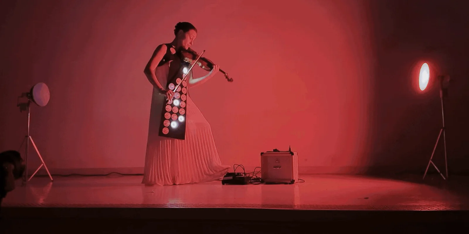
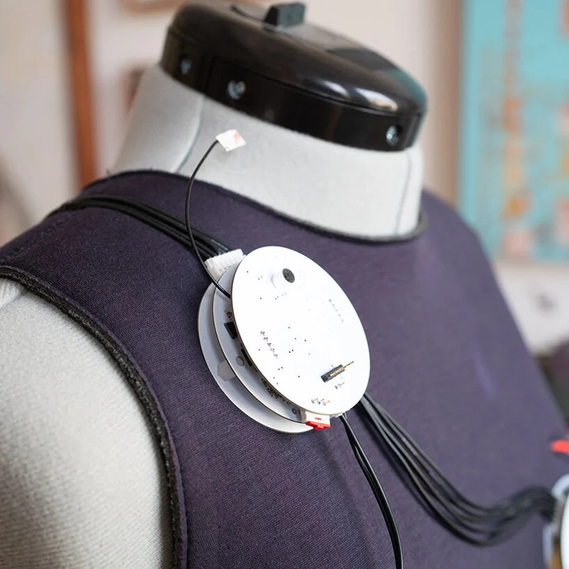
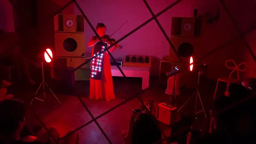
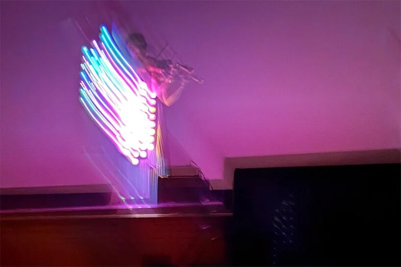
Robertson taught himself electrical engineering and programming to build the first garment. Forty-six display panels front and back, more than three thousand LEDs, forty-seven batteries, roughly thirty frames a second, five fixed colours per panel. It generates its own Wi-Fi so he can connect a tablet and trigger programmes mid-performance, and an on-board microphone feeds audio values into some of the effects. Version 2.0 moves to RGB to escape the five-colour limit and wraps transparent panels a full 360 degrees.
Our read: forty-seven batteries is the number worth sitting with, more than the three thousand LEDs. A wearable has no truss to hide in and no dimmer beach to run back to — every choice is paid for in weight, on a performer who still has to play. Note too where 2.0 spends its effort: not on brightness or count, but on escaping five fixed colours. Palette was the binding constraint all along, which is the one a composer working from colour hits first.
via designboom ↗
Scriabin wrote a light part in 1911 and never said how to play it
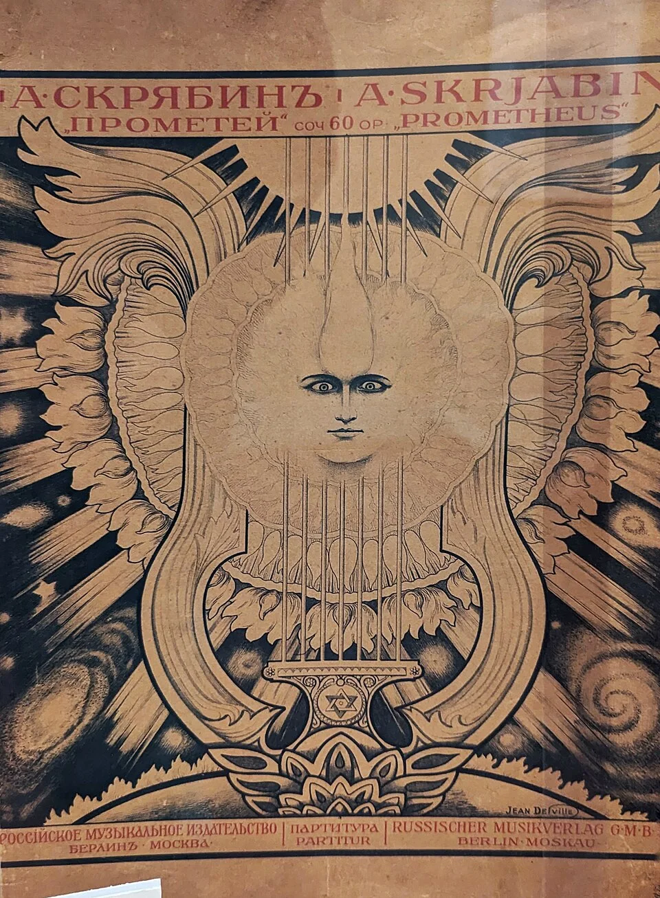
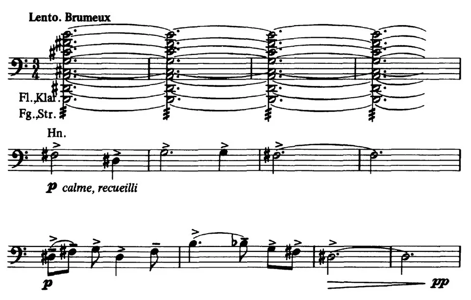
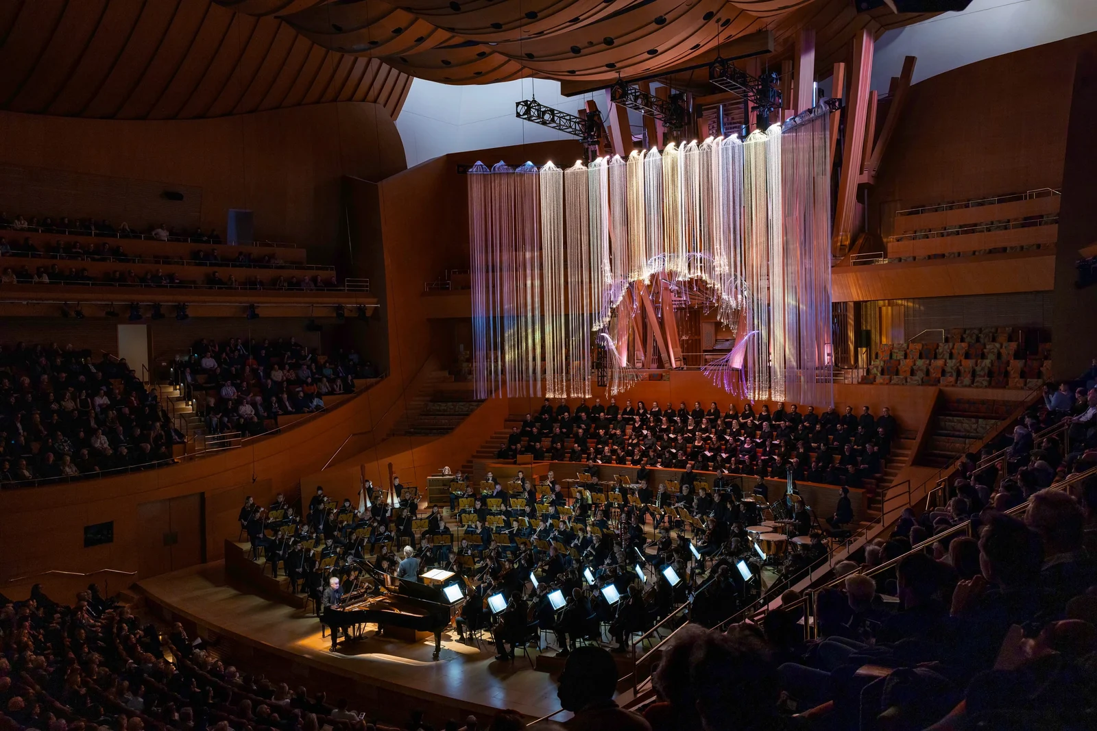
Scriabin scored a colour-organ part — marked luce — into Prometheus: The Poem of Fire, on its own treble stave at the top of the page. It premiered in Moscow on 2 March 1911 (15 March by the Gregorian calendar) without lights, and was first performed with coloured lighting on 21 March 1915 at Carnegie Hall. Sources still disagree on what he wanted: colours on a screen, or the whole hall flooded. The score never explains how two different colours are to be shown at once.
Our read: a hundred and fifteen years on, that last sentence is still the job. The notation specified intent and left realisation open, so whoever built it first had to decide — and every revival since has decided again. Most briefs arrive with a gap like it somewhere. The gap is not the problem; finding it at ten o'clock on a show night is.
Soto: Pénétrable BBL Jaune
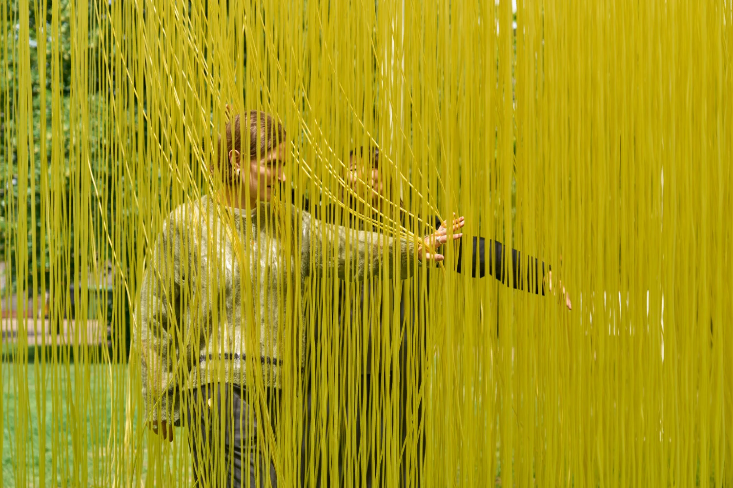
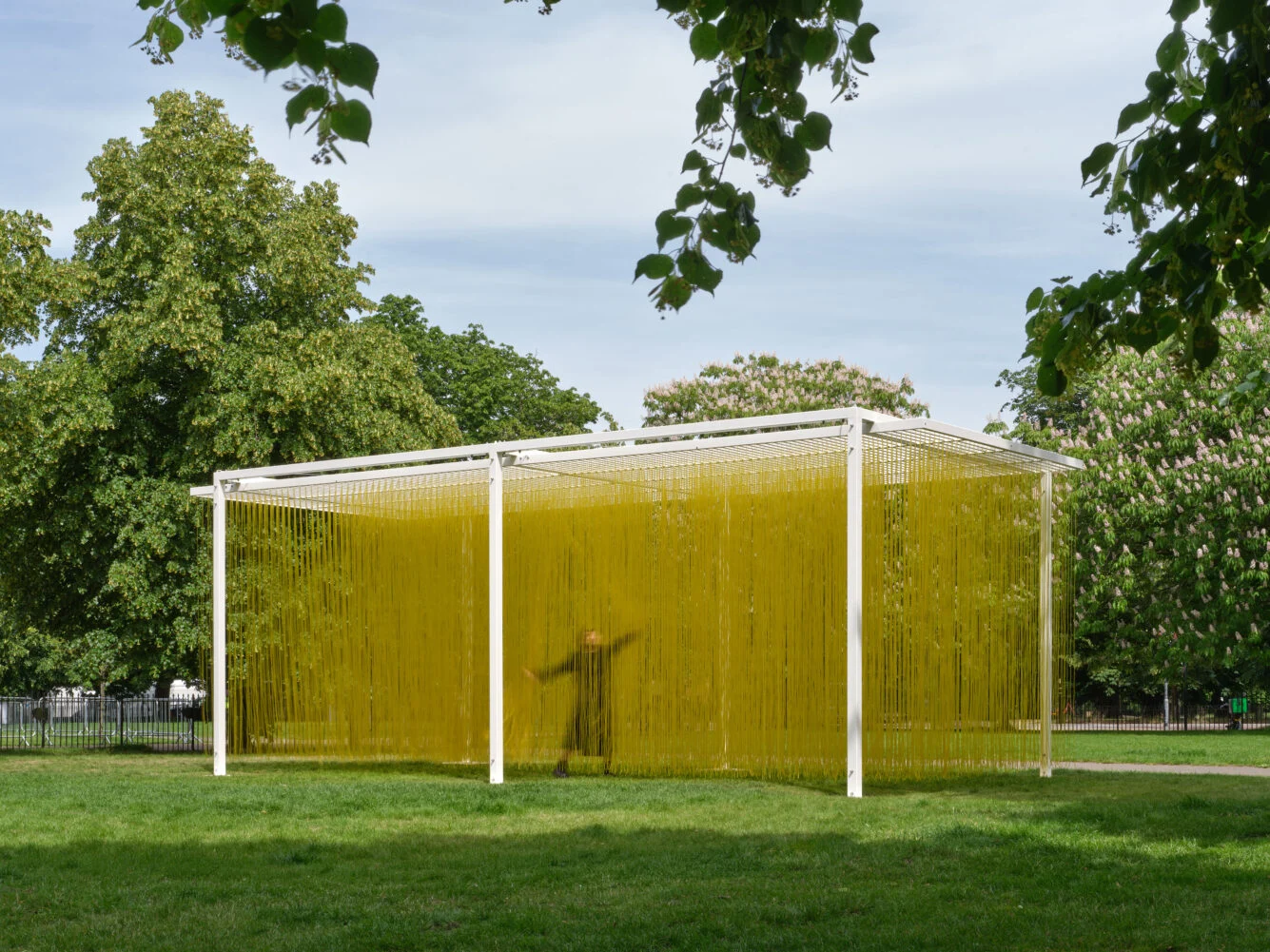
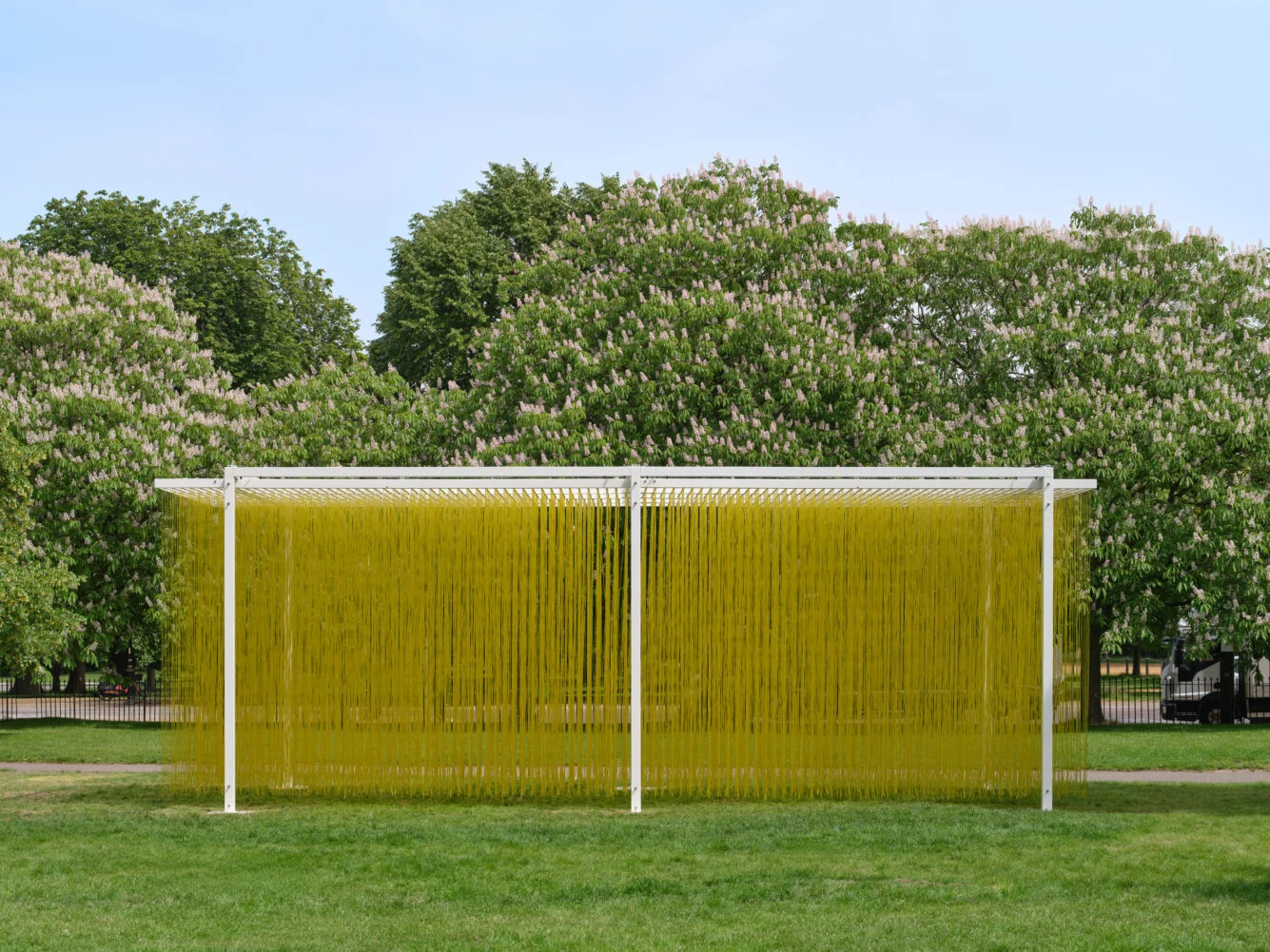
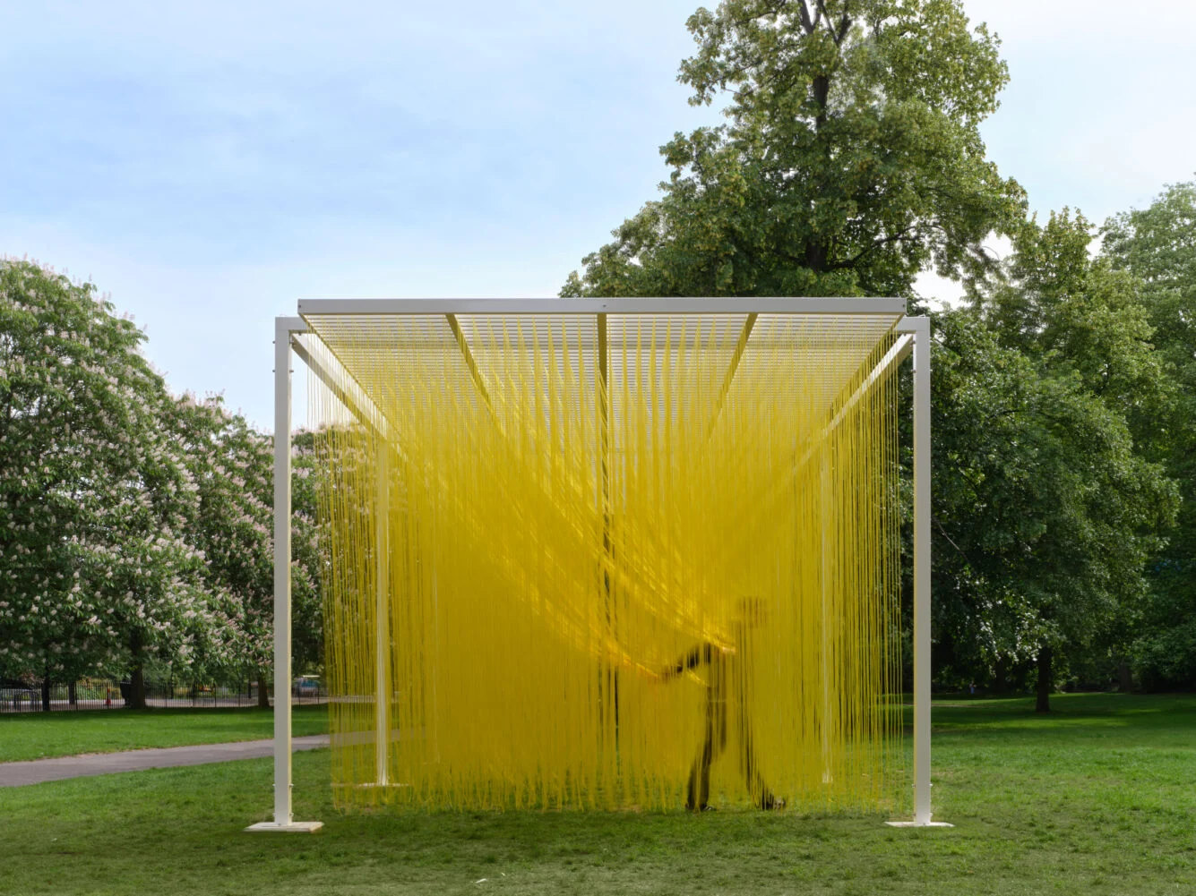
Serpentine South, Kensington Gardens, free, to 25 October. Jesús Rafael Soto (1923–2005) hung a block of yellow cord you walk into. From outside it reads as a solid — a wall of colour. Step in and it opens around you and closes behind.
Our read: the clearest argument in this issue that the audience does the last translation, and it needs no power, no control system and no cue stack to make it.
via Serpentine ↗
Light Dialogues at the ZfIL
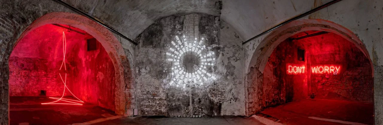
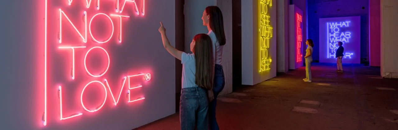
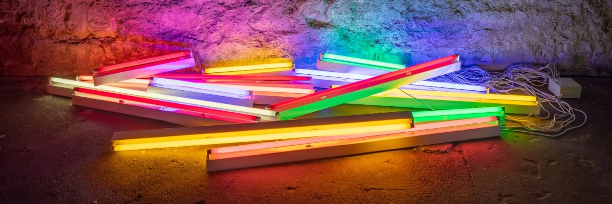
Unna, to 10 January. Around twenty works from SCHAUWERK Sindelfingen in the ZfIL's underground galleries — Flavin, Morellet, Nannucci, Armleder, Kowanz, Creed, Emin, Sonnier — arranged in three rooms: Form, Colour and Sign.
Our read: Sign is the room for this issue. Light used as text is where the subtitle problem stops being a metaphor and becomes a material with a legibility budget.
via ZfIL Unna ↗
Jennifer Steinkamp on Market Street
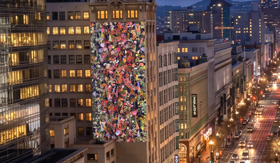
785 Market Street, San Francisco, free, to 3 December and again 14 December to 15 January. SFMOMA has put Steinkamp's 2008 digital work on the side of a building — the Cosm question from the other direction.
via SFMOMA ↗
Signal Festival
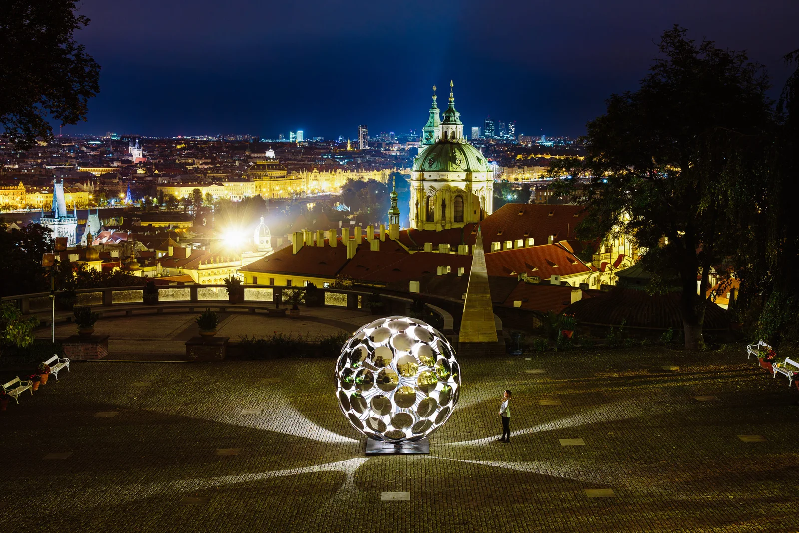
Prague, 15 to 18 October — not yet open. The annual reminder that a whole audience will walk several kilometres in the cold for light.
The rest of the month is on the Calendar.
Curated by Neves Creative. Every item links to its original source.